Protecting the Design Intent
We had a problem, historically, with the design intent of
student-facing experiences drifting between what was designed and
what was configured in our LMS.
This was caused by a disconnect. The product & design team would
craft a student experience, the internal tools team would translate
that experience into the LMS, and another team would use the LMS to
set up or manage products, courses, or platform features.
The drift was always felt most when a tool was directly affecting a
student's experience, and this was a case where it affected their
experience and success. It was important that we reduced
this drift.
So, for this project, I worked directly with our internal tools
developers to create a space in our LMS for instructional designers
to create and manage Flashcards and to hopefully avoid this drift.
I intended to implement strict guardrails to the word count and
image size within the LMS to prevent drift between the intended
design and what was actually built.
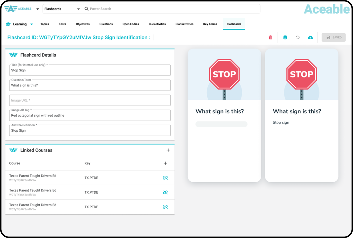
Unfortunately, our internal tools team provided another constraint.
We would have to re-use the layout and capabilities of the page that
already existed in our LMS for creating and managing glossary terms.
This constraint meant that image sizes could not be enforced, which
meant a character limit wasn't safely possible.
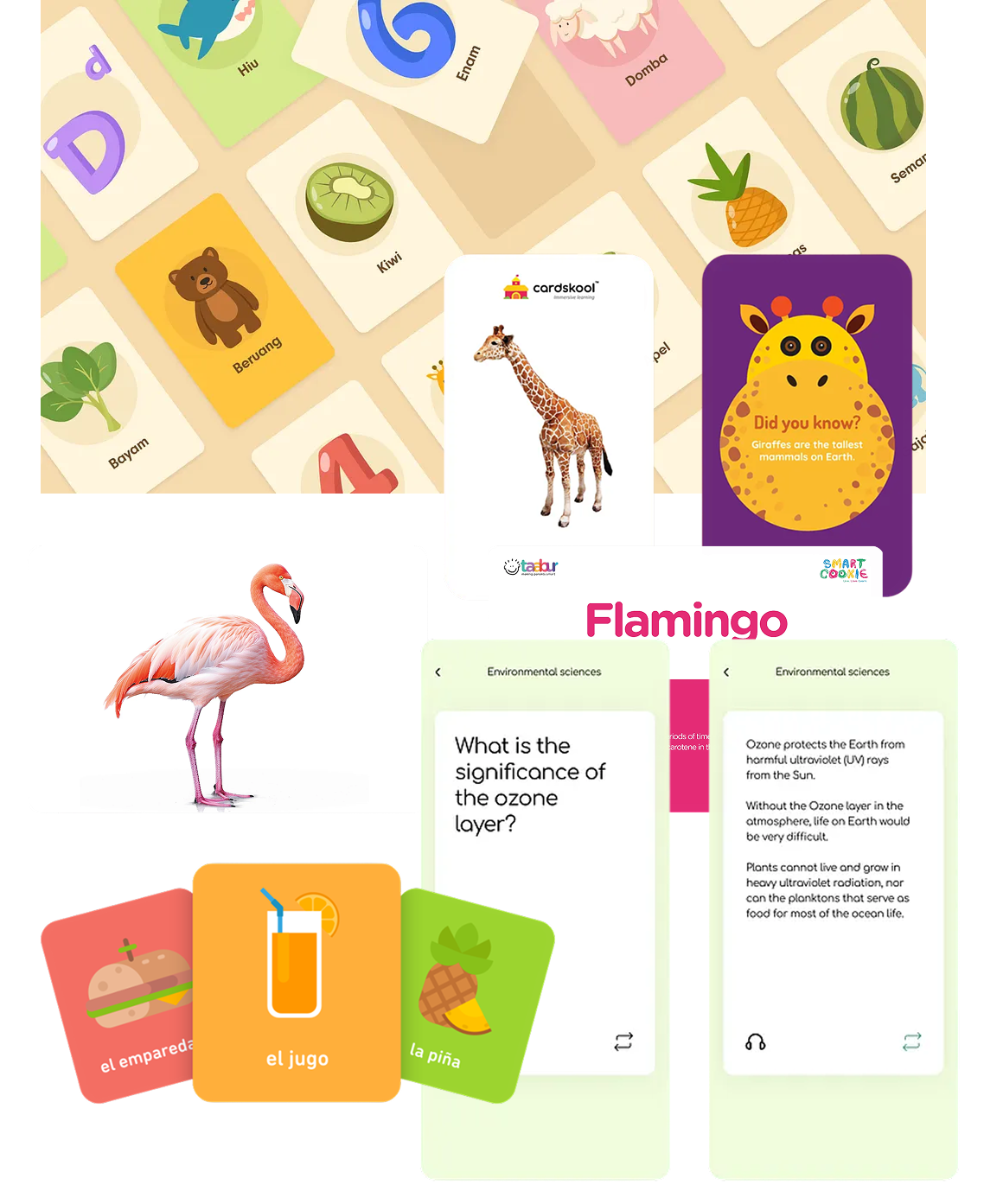
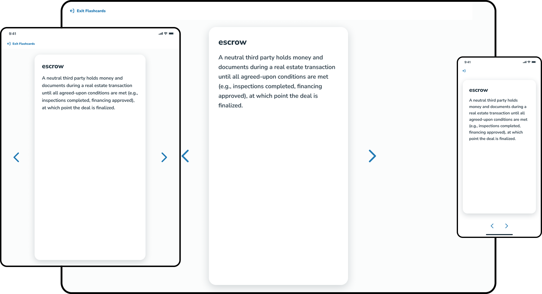
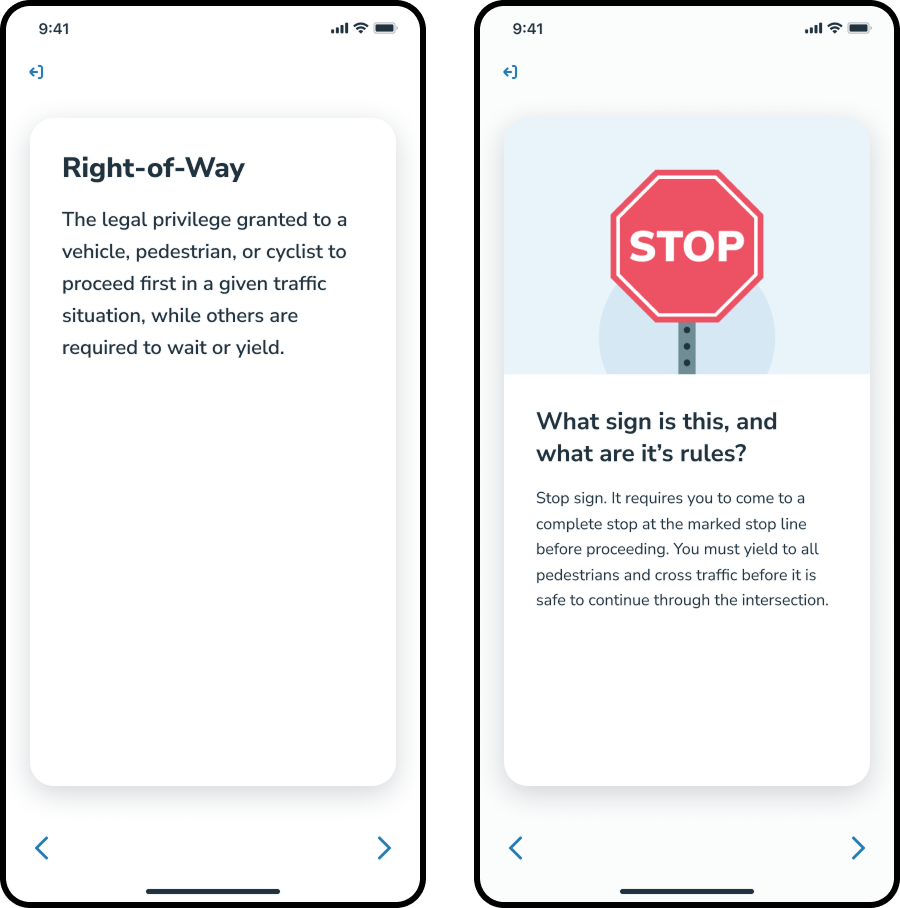
The compromise was to add a pixel-perfect preview in the LMS of
the smallest possible Flashcard a student would see. If
something breaks, instructional designers can see it and fix it.
This would hopefully be a strong enough guardrail.
I also held a training with the Learning Experience team once the
tool was built where I showed the design, explained the design
intent, and presented the example illustration and suggested the
team use that as a basis for their work.
The preview and training were not enough. When
the learning experience team began creating flashcards, they did
not match our design intent.